Typography Task 3A: Type Design and Communication

13 Oct 2021 - 27 Oct 2021 (Week 8 - Week 10)
Zetie Binti Bahaman / 0351297 / BDCM
Typography
Task 3(A): Type Design & Communication
LECTURES
All lectures have been completed in Typography Task 1/ Exercises.
INSTRUCTIONS
For Task 3A, we are to construct a typeface for the letters a i m e p y t g d o b ! , . This task will be using Adobe Illustrator and FontLab7. We will deconstruct an existing typeface among the 10 typefaces and use it as a reference.
Task 3: Type Design & Communication
1. Research
 |
| Fig 1.0 Typeface Inspiration, Week 7 (6/10/2021) |
I put together a bunch of styles of typeface that I wanted to recreate. It's leaning towards a san-serif type but I'm still deciding between a bulky or minimal style.
2. Sketches
 |
| Fig 1.1 Sketches for letter O, Week 8 (13/10/2021) |
Note:*The purple stars indicate the styles that I want to develop.
 |
| Fig 1.2 Sketches for letter D, Week 8 (13/10/3021) |
I developed the letter 'd' to see how the styles look in descender letters.
 |
| Fig 1.3 Sketches Draft 01, Week 8 (13/10/2021) |
I decided to add similar styles together using some of the letters that we are required to use. I really like option 2 as it is more unique with the curvature and gives it a modern sans serif font. Mr. Vinod seems to agree with me as well and gave extra research points to look up.
Based on the feedback, I continued sketching the rest of the required letters with the same style as option 2. (This time less shading.)
Based on the feedback, I continued sketching the rest of the required letters with the same style as option 2. (This time less shading.)
 |
| Fig 1.4 Sketches of letters b,g, i, p,y, t, and full stop, Week 8 (13/10/2021) |
 |
| Fig 1.5 Sketches of letter e and m, Week 8 (13/10/2021) |
 |
| Fig 1.6 Sketches of punctuation marks, Week 8 (13/10/2021) |
Type Deconstruction
 |
| Fig 1.7 Deconstructed letter 'd' - P22 Bayer reference, Week 8 (13/10/2021) |
 |
| Fig 1.8 Deconstructed letter 'o' - P22 Bayer reference, Week 8 (13/10/2021) |
 |
| Fig 1.9 Deconstructed letter 'a' - P22 Bayer reference, Week 8 (13/10/2021) |
I found a similar font to the Herbert Bayer font and used this for the type deconstruction. I will digitize my typeface design based on this font (P22 Bayer) reference.
3. Digitization
 |
| Fig 2.0 Typeface in wireframe view, Week 9 (20/10/2021) |
 |
| Fig 2.1 Typeface after unite with pathfinder, Week 9 (20/10/2021) |
 |
| Fig 2.2 Typeface Draft 01, Week 9 (20/10/2021) |
Amendments
 |
| Fig 2.3 Letter 'e' Progression, Week 9 (20/10/2021) |
 |
| Fig 2.4 Letter 'm' Progression, Week 9 (20/10/2021) |
 |
| Fig 2.5 Letter 'i' Progression, Week 9 (20/10/2021) |
 | |
| Fig 2.6 Letter 'g' Progression, Week 9 (20/10/2021) |
 | |
| Fig 2.7 Letter 't' Progression, Week 9 (20/10/2021) |
 | |
| Fig 2.8 Letter 'i' Progression, Week 9 (20/10/2021) |
 | |
| Fig 2.9 Guides and digitalized font design, Week 9 (20/10/2021) |
Measurements (from baseline)
Ascender and descender: 710 pt
Capital height: 666 pt
Median: 500 pt
Descender: -200 pt
Final Digitization
Final Digitization
 |
| Fig 3.0 Amended font design, Week 9 (20/10/2021) |
I made changes based on Mr. Vinod's feedback. The blue overlay is the amended version of the letter.
 |
| Fig 3.1 Anchor points of digitalized letters, Week 9 ( 20/10/2021) |
 |
| Fig 3.2 Final digitalized letters, Week 9 (20/10/2021) |
The typeface looks more consistent than the previous design.
4. Developing font in FontLab 5 and FontLab 7
 |
| Fig 3.3 Copy and Paste of letters from AI into FontLab 5, Week 9 (24/10/2021) |
I referred to the demo video by Mr. Vinod for FontLab 5 and FontLab 7 to develop my font. This software was quite a struggle to learn at first. Since the version that I downloaded did not look like the demo video and things were not going as smoothly as how Mr. Vinod demonstrated.
 |
| Fig 3.4 Letter Kerning in FontLab 5, Week 9 (24/10/2021) |
 |
| Fig 3.5 Full Letter Kerning in FontLab 5, Week 9 (24/10/2021) |
 |
| Fig 3.6 Font Generated via FontLab7, Week 9 (24/10/2021) |
Unfortunately, there was a watermark issue when I exported via FontLab 5. I downloaded FontLab 7 and it was a success to export with no issue.
 |
| Fig 3.7 Font Installation, Week 9 (24/10/2021) |
After installing the font on my desktop, I tested out some words and made a display poster.
5. Final Outcome
 |
| Fig 3.8 Gemini - Type Display Poster, Week 9 (20/10/2021) |
Here is the type display poster for my final font design. I created a custom symbol of the horoscope with the same curvature and stroke I used to design the font. I came up with the word Gemini, a horoscope for the name of my font. The reflection is a depiction of the Gemini twins. Just like a Gemini, I feel my typeface is something different and quirky. It's also not conforming as my font is neither a serif nor sans serif, but something in between.
 |
| Fig 3.9 Sample words, Week 9 (20/10/2021) |
 |
| Fig 4.0 Sample word "dobby", Week 9 (20/10/2021) |
I typed out some sample words using my font.
Final Task 3A: Type Design and Communication
Font Download: https://drive.google.com/file/d/1aXR9p-o6u2VslElfXUfoxUT6M5WHavVn/view?usp=sharing
 |
| Fig 4.1 Final Task 3A: Type Design and Communication "Gemini - Regular" - JPEG, Week 10 (27/10/2021) |
 |
| Fig 4.2 "Gemini - Regular" Typo Poster A4 - JPEG, Week 10 (27/10/2021) |
Fig 4.3 Final Task 3A: Type Design and Communication "Gemini - Regular" - PDF, Week 10 (27/10/2021)
Fig 4.4 "Gemini - Regular" Typo Poster A4 - PDF, Week 10 (27/10/2021)
Overall, I have spent an average of 70 to 90 hours in total on this assignment. Hope it's worth it!
FEEDBACK
Week 8 (Independent Learning Week)
Specific Feedback:
Option 2 seems interesting and something I can further develop. I should look upon Herbert Bayer's typeface and read up to get more references. Mr. Vinod also suggests that I speed up my work process and try to avoid shading my sketches too much.
Week 9
General Feedback:
Analyzing existing typefaces will help us develop our typefaces better when we see similar problems and adjust to them.
For the following step, if FontLab 7 is used, ensure that the vector artwork is retained to avoid the bitmap version.
Specific Feedback:
My typeface design was irregular and inconsistent. This is due to some axis being bent towards the right and some to the left, which is also causing the awkward thicknesses of the strokes.
I managed to make new changes to the letters to show Mr. Vinod again before the class ends. My typeface looks better but I still need to work on the gaps and reduce the abruptness from a straight stroke to a curve. Hence, it gives it a more organic look.
Week 10
General Feedback:
Mr. Vinod encourages us to maintain a final submission toward the end of the post (before feedback). He also mentioned we indicate how many hours we spent (in total) on this task. Those that did not provide the link to the generated font for Task 3(A) should do so.
Specific Feedback:
Good job on the typeface, very consistent in look and feel.
REFLECTIONS
Experience:
This task started to be a fun process until I realized how much of a challenge it was. Just like the previous tasks, it's a whole process as there are numerous technicalities to consider. Although I wish I could do things better or differently, I am satisfied with the typeface I have created within the amount of time given. It is also exciting to have my font and see something I sketched out on paper come to life. In the future, I hope to complete the whole alphabet.
Observations:
After reading about Herbert Bayer, I noticed that the font is not even if it looks equal. Through deconstruction and analysis of letterforms, it makes me realize how important details are, and perceive the font as if it is equal.
Findings:
In this task, I found that designing a font requires time and attention to detail. I became aware of the significance of such nuance of a font. The slightest change to every stroke or stem widths can make or break the type design. It has made me cautious of my design decisions, and I hope to continue to carry these observational skills with me throughout my journey as a designer.
FURTHER READINGS
 |
| Fig 4.5 Typographic Design: Form and Communication (2015) |
Reference:
Carter, R., Day, B., Meggs, P. B., Maxa, S., & Sanders, M.
(2015). Typographic design: Form and communication.
Hoboken, New Jersey: John Wiley & Sons, Inc.
Chapter 12: Chapter 12: Typographic Design Process: A Case Study (Ludd: A typographic expedition)
Chapter 12: Chapter 12: Typographic Design Process: A Case Study (Ludd: A typographic expedition)
 | ||
Fig 4.6 Type Design Process, Chapter 12, page 242
|

The imposition of a modular grid imposed a structural system that organized these disparate references and established Ludd's visual vocabulary. Ludd has a significant geometric look and feel as a result of the grid, which is expressed through unique interpretations of typographic forms.
According to Ludd, the sketching phase was critical because the manual design process allowed him to conduct careful review and evaluation at each stage of the evolution.
After looking at these sketches, I decided to come up with ideas and used graph paper to design my font.
 |
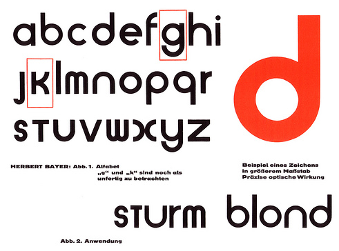
| Fig 4.8 Universal Typeface by Herbert Bayer, (Source: luc.devroye.org) |
Reference:
Following the feedback session from Week 8, Mr. Vinod recommended that I read up on Herbert
- Bauhaus typography. (n.d.). An Introduction to the History of Graphic Design. https://www.designhistory.org/Avant_Garde_pages/BauhausType.html
- Herbert Bayer (1900 - 1985) - Universal typeface - Bauhaus master. (2021, June 5). Encyclopedia of Design. https://encyclopedia.design/2021/06/05/herbert-bayer-universal-typeface/
Following the feedback session from Week 8, Mr. Vinod recommended that I read up on Herbert
Bayer's universal typeface.
Herbert Bayer (1900) designed the universal typeface, 1925, as a geometric alphabet based on bar and circle to perform effectively in a technological society. "Bayer rejected the “archaic and complicated gothic alphabet” which lingered in the most scientifically advanced society of its time, Germany of the first world war period and the postwar era." ("Herbert Bayer (1900 - 1985) - Universal typeface - Bauhaus master," 2021)
Herbert Bayer (1900) designed the universal typeface, 1925, as a geometric alphabet based on bar and circle to perform effectively in a technological society. "Bayer rejected the “archaic and complicated gothic alphabet” which lingered in the most scientifically advanced society of its time, Germany of the first world war period and the postwar era." ("Herbert Bayer (1900 - 1985) - Universal typeface - Bauhaus master," 2021)
He did not see the need to have capital letters for each letter and felt serifs were unnecessary. Instead, he wanted to create a type that would help typesetting and simplify the typewriter keyboard layout.
I personally think the minimalism makes the overall typeface visually appealing. The graphic's design encapsulates Bauhaus's modern, effective, and directness while also highlighting its most cited trait of minimalism. While analyzing the typeface, I realize the typeface is harder to recreate than it seems to be. It's not a perfect round circle and it takes time to make it look organic and curve smoothly with the strokes.
I personally think the minimalism makes the overall typeface visually appealing. The graphic's design encapsulates Bauhaus's modern, effective, and directness while also highlighting its most cited trait of minimalism. While analyzing the typeface, I realize the typeface is harder to recreate than it seems to be. It's not a perfect round circle and it takes time to make it look organic and curve smoothly with the strokes.
 |
| Fig 4.9 From Drawing To Font, (Source: Letterfountain.com) |
Since my typeface was inconsistent and had several consistency issues, I decided to read up more on the anatomy of letters.
Classification according to form and construction
 |
| Fig 5.0 Classification according to form and construction, (Source: Letterfountain.com) |
Based on the photo, the alphabets are classified according to their form and construction. There is a group for capital letters and a group for lowercase letters. I find this interesting as each letter has its own group to identify with.
What You Measure Is Not What You See
 |
| Fig 5.1 Sample of letterspacing in a word, (Source: Letterfountain.com) |
The distance between letters also usually requires a visual correction. It is not possible to simply arrange letters with equal spacing between them. The letters must be changed to have a consistent 'visual' white space, which implies that the white space between the letters should appear similar.
 |
| Fig 5.2 Visual correction applied on shapes, (Source: Letterfountain.com) |
As seen above, when designing a new type, many different forms and constructions must be considered. Extrusion of curved (and protruding) forms past the baseline and top line is an important visual correction. This also holds true for the vertical alignment of curved and straight forms.
Letters with Legs
 |
| Fig 5.3 Sample Letters, (Source: letterfountain.com) |
There are four letters that are inexorably linked because they all stem from the same letter: the 'n.' These are the letters 'n,' 'h,"m,' and 'u.' The letter 'r' can also be included in this category because, in the case of sans-serifs at least, it can be interpreted as a cut-off 'n'.


Comments
Post a Comment